2027 wedding table inspiration · Toronto & the GTA
Wedding Table Trends for 2027: Patterned Plates, Sculpted Edges and Coloured Glass
Three ways to bring personality to your wedding table, with colour palettes built around the pieces your guests will see up close.
Explore the palettes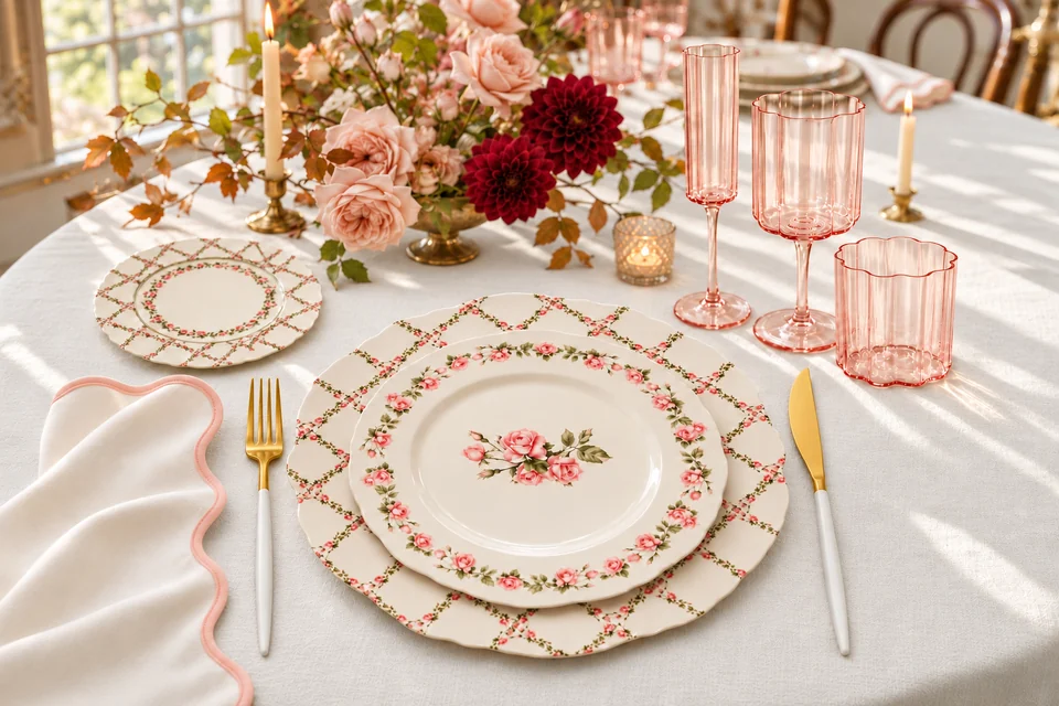
A wedding table has to work at two distances. From across the room, it should feel inviting and coherent. At each seat, the details come into focus: the curve of a plate, the colour of a glass and the texture of the napkin beside it.
Looking ahead to 2027, wedding design forecasts point toward more personal settings, expressive tableware and thoughtful layering. Patterned ceramics, shaped edges and coloured glasses all feature in Bastide du Roy’s forecast, while Ambience Venue Styling’s 2026/27 inspiration guide highlights organic greens, butter yellow and texture.
For couples planning a Toronto or GTA wedding, those directions offer a useful starting point. Here are three ways we would interpret them using The Plate Company’s collections. The palettes are our styling suggestions, rather than a ranking of what couples are booking.
The images below are AI-generated styling concepts made with our collection photographs as references. They illustrate colour and composition; consult the original collection photographs for exact product details. Flowers, tablecloths, furniture and other styling props are not implied rental inclusions.
1. Patterned plates that set the colour palette
A patterned plate can make the first colour decision for you. Rather than selecting a tablecloth, flowers and stationery independently, look closely at the plate and pull out two colours that already belong together.
The Rosette Collection gives you pink roses, green leaves and a warm ivory background. Those details can support a light garden setting, but they also work with a deeper accent.
Use ivory as the broad background, blush in the glassware and flowers, and burgundy in a few blooms. The deeper colour gives the soft pinks definition without changing the character of the china. A low floral arrangement leaves the plate’s roses visible across the table.
The detail that makes it work: place the napkin beside the plate rather than covering its central motif. If you want another pattern in the linen, choose a different scale—a broad stripe is easier to distinguish from tiny rose garlands than another equally detailed floral print. Repeat one shared colour between them.
2. Sculpted ivory plates with a cooler colour around them
A white or ivory setting can carry plenty of detail through shape. Scalloped outlines and raised decoration give the eye something to notice without requiring several competing colours.
The Maison Blanc Collection is a useful starting point for this approach. Its creamy finish and sculpted edges can sit within a warm neutral scheme, or provide a soft foundation for cooler blue accents.
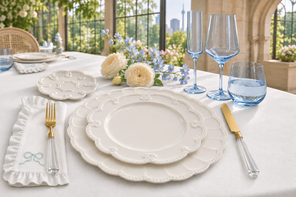
A white tablecloth keeps the setting light, while our white ruffled Blue Bow napkin introduces a pale blue/aqua detail beside the plates. Pale-blue Juliet glassware repeats the colour in a translucent material. Our Crystal Acrylic cutlery adds clear faceted handles and a small warm accent through its gold-finish heads.
The detail that makes it work: keep the napkin fold and flowers relatively simple so the shaped rims remain the focus. Review the actual linen sample beside the porcelain: a cool white and a warm ivory can look quite different together under the venue’s lighting.
Only stack the pieces your meal needs. A charger, dinner plate and separate bread plate can create a considered setting without adding an unused decorative layer. Our charger plate and dinner plate guide explains their different roles.
3. Coloured glassware that carries the palette through the table
A glass adds colour at a different height from the plates and napkin. That makes it useful for carrying a palette across a long table, especially when the flowers stay low and airy.
With a patterned plate, start by echoing a colour already in the design. The green vines and ribbon details in Botanical Bow give softly green-tinted glassware a clear connection to the setting.
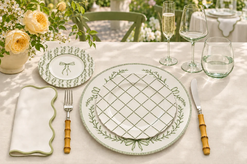
Use light beige linen as a neutral base, with our White Green scalloped napkin giving the plate pattern some breathing room. Bring in butter yellow through the flowers. Juliet Green glassware repeats the botanical colour without adding another printed motif. Classic Bamboo cutlery adds natural texture with bamboo handles and polished stainless-steel heads. A few yellow and white flowers add warmth without making the tablecloth another strong colour.
The detail that makes it work: look at the glasses both empty and filled. Water, wine and cocktails change how a tint reads, and a glass that seems almost clear in daylight can look different against a darker background. One coloured glass alongside a clear one can also provide enough colour if you prefer a quieter result.
Each styling concept shows three matching glasses: water tumbler, wine glass and champagne flute. For your own event, choose the glasses around the drinks you will actually serve. A water glass, wine glass and toast glass are separate service decisions—not three pieces every setting automatically needs.
How to make a trend work in your venue
Before booking, assemble one complete sample setting and ask four questions:
- What is the largest colour surface? A white or light beige tablecloth gives the room a neutral foundation, letting the plate designs, glassware and flowers carry the colour. Choose it with the venue’s chairs, floor and walls in view.
- Where should the eye land? If the plate is the focal point, give its pattern room. If the flowers are colourful and abundant, a sculpted ivory setting may provide a calmer foundation.
- How does it look after dark? Check your samples under the venue’s evening lighting as well as daylight. The same blush, ivory or pale green can read differently under warm lamps and candles.
- Is there room for dinner? Add the full cutlery and glassware selection, bread plates and any shared dishes before approving the layout. Leave comfortable space for guests and for staff to clear each course.
Explore our wedding tableware rental looks for Toronto celebrations for four combinations shown in real collection and event photographs. Lily of the Valley, Rosette, Bowing Blue and Botanical Bow offer starting points for carrying a colour palette through plates and glasses.
Build around what you already have
You can bring these ideas into a wedding without replacing every piece the venue provides. A patterned salad plate can add character to a plain white setting. A coloured water glass can introduce a palette at each seat. A distinctive napkin can connect the tableware to the flowers.
Start with the venue’s included pieces, then choose the changes that make the table feel personal. For quantities, use our wedding tableware rental checklist.
Planning a wedding in Toronto or the GTA? Explore our dinnerware, glassware and napkins, then share your date, venue, guest count and favourite palette. We can help you identify the pieces to request and confirm availability for your celebration.
Published November 8, 2026. Trend context: Bastide du Roy’s 2027 wedding forecast and Ambience Venue Styling’s 2026/27 inspiration guide. Palettes and styling proposals are The Plate Company’s interpretation. Imagery: AI-generated styling concepts using The Plate Company’s collection references.